Author Archives: ctamimie

Universities and Branding: How Visuals Ultimately Communicate Values

Introduction
For the third part of this analysis, it is important to re-introduce the research question posed at the end of the second section. While the analysis of specific artifacts that are a part of RIT’s “Catch the Spirit” campaign have already been introduced and analyzed, it is further important to note that this section will draw relevant conclusion regarding the analysis by answering the proposed research question: “how do the principles of visual rhetoric in university advertisements combined with the marketing principles of branding of universities visually communicate specific potential messages to intended audiences?” It has already been discussed that that as universities attempt to communicate a broader message to potential students using the principles of branding. Additionally, the point has already been made that there is a potential for visuals used in the branding of universities to assist in creating those messages. As such, it is important to re-visit the artifacts previously discussed to more fully understand the rationale that will lead to conclusions about the research question.
Analysis Findings
The first artifact was identified in the first section of this paper as a banner advertisement from an online Admissions campaign for the Rochester Institute of Technology. The advertisement features the RIT Men’s Ice Hockey team after winning a championship game. A number of spectators in the background are also RIT students or supporters as they are wearing RIT “gear.” It can be interpreted by the joyous expressions on the faces of those in the photo, the fact that the team is holding up the championship cup, and the fact that the bleachers are packed that this photograph is meant to capture the idea that RIT is full of school spirit. The slogan “Catch the Spirit” arguably is inviting future students to join in. As both Wiese (1994) and Judson et. al. (2008) mention in their research, it is advertisements like these that are meant to communicate a deeper message to the students such as that RIT is an exciting place, full of school spirit, and ultimately that potential students should want to enroll because of these factors. The second artifact presented was also an advertisement for RIT and featured a number of supporting images meant to be a part of this “Catch the Spirit Campaign.” The advertisements featured students wearing RIT shirts and exhibited various activities that RIT students are involved in, such as playing intramural soccer, or building a robot for an engineering fair, or simply grabbing a cup of coffee from an on-campus coffee shop. Judson et. al. would argue that the presence of RIT’s logo is intentional as it is meant to create a specific brand that will capture the essence of RIT’s community with one visual.
It is now important to briefly reflect on what more specifically the intended message of the rhetor might be. To revisit Scott, there is academic research that supports the idea that images in advertising do in fact communicate specific and broader meaning than the literal interpretation of what is happening in the image (1994). Specifically, the first artifact as a piece of visual rhetoric may intend to communicate a few different messages. First, the image of victory and of joy on the team’s faces in addition to the image of the cup placed as the dominant focus in the image indicates that the rhetor’s intention may be to communicate first that RIT is a “winner” as a team is depicted victorious. Perhaps the cheering crowd in the background is meant to represent RIT as a supportive and enthusiastic community. Ultimately, however, it is arguable that perhaps the depiction of RIT as victorious could communicate the deeper message that RIT is the “winning” school for potential students and that they, like the hockey team, will be successful, joyous, and a part of a tight-knit community that roots for each other and takes pride in itself. There is this similar feeling of community communicated in the second artifact which features closely interwoven images of RIT students participating in a vast array of events and experiences that arguably are meant to capture that same feeling of “victory” There is a strong sense of camaraderie in each of the images as many students are seen embracing each other or working closely with each other and professors. Perhaps this paired with the abundance of individuals wearing RIT garb is meant to communicate first and foremost that members of the RIT community enjoy being a part of the community. What is arguable and will ultimately be addressed in the contribution section is that it is through depicting such images as these that RIT attempting to gain enrollment. According to Wiese, universities attempt to gain student enrollment by initializing what he calls the “recruitment process” that consists of soliciting to students via advertising, face to face initiatives, and other attempts to communicate to students that their particular college is where they want to be (1994). It is possible, therefore, that the images show students participating in, perhaps, activities that potential students either participate in themselves or want to participate in and because of the inviting nature of the photographs, students may ultimately be influenced to enroll. It is interesting that what is absent in these images is, understandably, students engaging in unsavory behavior and students engaging in behavior that may be viewed as boring. Students, faculty, and staff are presented in what appears to be a positive and engaging light. The question still remains, however, that can the assumed messages conveyed by these images really get through to its target audience, particularly if we take away leading text?
Contribution
While it has been previously mentioned that symbols in advertising often work to communicate a broader meaning than their literal meaning to the intended audience, Scott (1994) also makes another significant contribution to this discussion. Scott emphasizes that it is not just the symbols themselves but the delivery, or the manner or method by which the various symbols that make up an image are arranged, that ultimately drive what the actual intended meaning is (1994). Therefore, just as a politician may strategically craft his speech, emphasizing certain points, omitting certain things, etc. Scott argues that the rhetor or creator of an image does the same thing (1994). What can be argued, therefore, as Judson et.al. (2008) has identified that in fact, all universities use some form of advertising and moreover a large portion of that is visual advertising, it can be concluded that in fact, images used for university advertisements do intend to communicate a deeper meaning due in part to the unique and strategic presentation and arrangement within the images themselves. In the previous section, it was discussed that RIT does not feature advertisements with students engaging in unsavory behavior because arguably, the deeper meaning that they desire to convey is that their university is a suitable choice for potential students. This goal is arguably what all university advertisements ultimately seek to achieve. True, there may be nuances and different methods of how this conclusion is reached; however, the point is that though the goal may still be the same for each university, it is their delivery of images that will most likely determine potential student’s interpretation of the deeper meaning behind the image and if the students will realize the broader goal of securing enrollment that the advertisements are seeking to achieve. The reason that this generalization can be made is due to Wiese’s research which again states that all universities engage in some sort of recruitment process (1994). What is most important about this discussion, however, is the argument that a unique message can be communicated to an audience based on first, the content of the image, but more importantly how the image is arranged. In addition to the delivery of the image as important, Scott also focuses her research in the importance of the invention of the visual argument that advertisements make (1994). She explains that the invention is achieved by “capturing the benefit promised to the consumer, the support for the promise, the relationship to competitive alternatives, and the organizing argument or metaphor,” (Scott 1994, p. 265). It is arguable that university advertisements achieve this using strategies similar to the strategies imposed by RIT: feature students engaging in predetermined environments and activities with specific reactions that are meant to first depict “typical” college life for a student and second to convey the idea that the viewer of the message will want to be a part of that experience. As such, the conclusion that this research seeks to make is that by visually branding a university, the university is first able to communicate what kind of experiences and culture potential students will encounter in addition to making a broader statement about “who” the university is. As it has been established that visual advertisements quite often can achieve a broader meaning, i.e. the RIT students embracing each other in the image is meant to communicate something much greater than that they like each other, the argument can be made that advertising images depicting students, faculty, and staff engaging in specific experiences and exhibiting specific behaviors and reactions in those images will ultimately communicate what the university itself believes as a summation of its culture and values. Court et.al. specifically states that brands communicate values to consumers (1994). This discussion can now be drawn full circle in that because universities use branding principles and arguably often do so through visual methods, it can also be concluded that using the principles of branding and the tools of visual rhetoric that these advertising images not only communicate information about a potential experience, they communicate a greater value that the potential students are meant to interpret about the experience.
In other words, the importance of the artifacts used in this study are that they are actual examples of how a university visually communicates specific values. By depicting student’s experiences and illustrating them in a positive manner, the image is communicating what Scott describes as communicating the benefit and the exhibited behavior and reactions of individuals portrayed in the image is further proof that the promise will be upheld. Additionally, while competitive alternatives may not be directly addressed, Judson et. al. emphasizes that branding in and of itself is a competitive strategy that universities engage in to differentiate themselves (2008). Most importantly, it is this idea that the images communicate certain values that is in line with Scott’s claim that images create a metaphor. While it has been determined that this metaphor is communicated by the specific placement or arrangement within the piece in addition to the delivery, future study will need to examine this phenomenon outside of two artifacts from the same university. To truly prove that university’s are able to use visual rhetoric principles and branding techniques to communicate values, more artifacts from many universities will need to be included for study. Additional research must also be conducted on the connection between visual rhetoric, branding, and advertising with a particular focus on universities.

Court, D. C., Leiter, M. G., & Loch, M. A. (1999). BRAND LEVERAGE. Mckinsey Quarterly, (2), 100-110.
Judson, Kimberly M., Aurand, Timothy W., Gorchels, Linda, & Gordon, Geoffrey L. (2008). Building a University Brand from Within: University Administrators’ Perspectives of Internal Branding. Services Marketing Quarterly, 30 (1), 54-68.
Scott, L. M. (1994). Images in Advertising: The Need for a Theory of Visual Rhetoric. Journal Of Consumer Research, 21(2), 252-273.
Wiese, Michael, D. (1994). College Choice and Cognitive Dissonance: Managing Student/Institution Fit. Journal of Marketing for Higher Education, 5(1), 35-47.


Universities and Branding: Rationale for a Research Question

In the previous section of this discussion, it was explained that universities often design and project a brand to entice students to attend. Judson (2008) also suggests that these brands help to communicate specific values of both the students and the administration as a means to paint a further picture of what student’s actual experience will be like when they step on campus as a student. While Judson does not actually prove that universities are successful in creating specific perceptions in students, in a study conducted by Wiese (1994), it was concluded that first year college students who enter their first semester do in fact enter university believing that there is definite truth in the values projected by the university during what Wiese defines as the “recruiting process.” This process has been codified as in-person interactions with admissions staff, potential student interaction with websites and promotional materials like the banner ad described in the previous section, and in-person or online interactions with current college students (1994). Wiese also argued that because first year students come prepared with these conceptions, should they encounter a situation that contradicts their beliefs of what university students and faculty actually value, the first year students will engage in behaviors related to cognitive dissonance theory that seek to reduce this conflict in their beliefs with what the reality actually is (1994). This research will discuss the marriage some of these ideas and the principles of visual rhetoric. This research cannot reflect on any potential effects of messages communicated through visual projections of university “brands.” However, a definite link can first be drawn between how visually universities do in fact communicate their brand.

As it has been made clear that universities create a brand, it is first important to revisit this notion of what, exactly, a brand is and second and more importantly, how that brand is communicated to consumers. According to Court et. al. (1999) a brand, essentially, is a simple way of illustrating to consumers the values, cultural community, goods and/ or services offered, and ultimately what to expect when purchasing a product. Though universities are not products, per say, it has also been established that higher education research draws a direct parallel between consumers and potential university students as they “shop” for the right university just as they would the “right” vehicle (Judson et. al. 2008). As such, the brand of a university is therefore entirely designed to communicate values, cultural community and experience as explained above. While it is difficult to examine all methods by which any business communicates its brand in one research study, it is possible to isolate the study to simply looking at the visuals used to communicate said brand. Logos are arguably the most notable visual used to communicate a brand. Court et.al. (1999) explains that a brand’s logo can, in most cases, do two things. First, it can solely or almost entirely rely on visual elements to communicate the values, etc. of a company or product to consumers. Second, it can entice consumers to want to learn more about the brand and the product(s) it represents. It is important to note that Court does not suggest that the visual elements in a logo are able to entirely communicate all of the brand’s values, etc. he is simply stating that the logo at minimum assists in communicating those values (1999).

While RIT’s “Catch the Spirit” campaign does not have a specific logo, an examination of other visual advertisements used for the campaign reveals a definite theme in the composition of those visuals. In a PDF brochure that is accessible to students via the admissions website1, the striking theme is that nearly one hundred percent of the images depicting an RIT student involved in any given activity, at least one student is wearing RIT paraphernalia or the RIT logo is somehow incorporated into the shot. After identifying this phenomenon, this research will first attempt to discover the potential intent of the rhetor or creator, i.e. the admissions department, by reflecting on if principles of visual rhetoric are employed in these advertisements and second how those principles or strategies may or may not formulate a clear message for the intended audience. There are two important points from Scott’s discussion theory visual rhetoric can be summarized in two parts and are particularly pertinent to this research. First, images are artifacts that are meant to represent a deeper, cultural meaning that extends beyond the fact that images are simply designed for aesthetic pleasure; and, second, the study of visual rhetoric therefore places particular emphasis on the intent of the creator of the image as a method for hypothesizing what the message of the visual actually is (1994). Therefore, this research will seek to be able to explain the how values sanctioned by the university are intended to be communicated using the principles of visual rhetoric. As such the research question that will be addressed is as follows: how do the principles of visual rhetoric in university advertisements combined with the marketing principles of branding of universities visually communicate specific potential messages to intended audiences?

Notes

  1. Strict copyright infringement laws prohibited the uploading of the PDF to this website. The PDF referenced in the paper can be found by following the link embedded in the text or here.

Works Cited

Court, D. C., Leiter, M. G., & Loch, M. A. (1999). BRAND LEVERAGE. Mckinsey Quarterly, (2), 100-110.

Judson, Kimberly M., Aurand, Timothy W., Gorchels, Linda, & Gordon, Geoffrey L. (2008). Building a University Brand from Within: University Administrators’ Perspectives of Internal Branding. Services Marketing Quarterly, 30 (1), 54-68.

Scott, L. M. (1994). Images in Advertising: The Need for a Theory of Visual Rhetoric. Journal Of Consumer Research, 21(2), 252-273.

Wiese, Michael, D. (1994). College Choice and Cognitive Dissonance: Managing Student/Institution Fit. Journal of Marketing for Higher Education, 5(1), 35-47.
Universities and Branding: A Visual Analysis of Advertisements for the Rochester Institute of Technology

In today’s overwhelming world of digital media technologies in which instant gratification is now a click away and consumers are constantly flooded with advertisements designed to entice them to satisfy their every want and need, it is no wonder that colleges and universities are faced with the extreme challenge of “standing out.” Though many college students and potential students may have little idea that their university of choice implements a variety of strategies, particularly in their visual and online communication mediums, to create a specific “brand,” the purpose of this visual analysis will be to reflect on and support the notion that universities do, in fact, create such brands. This is most certainly not a new phenomenon. According to Judson et al., universities create brands and subsequently communicate those brands to a variety of audiences as a means for remaining competitive (2008 p.57). The focus of this analysis will be on a series of images that blend both pictures and text which are featured as a banner images at the header of websites for the Rochester Institute of Technology. The first image that will be analyzed can be found as a banner on the Rochester Institute of Technology’s Freshman Admissions homepage. The website’s copyright prohibits the online publication of this image, thus a link to the website referenced in this study can be found in the “Notes” section.1 The intended outcome of this analysis will be to reflect on how these banner images successfully communicate the brand created by RIT by examining principles of visual rhetoric and following the nine visual communication analysis steps as outlined by Helmers. Images that will be included in this study will be taken from but not limited to the RIT Admissions campaign titled “Catch the Spirit.”

To begin the analysis, it is necessary to first briefly describe the image that will be discussed and to place the image in context, as Helmers recommends. It is important to note that though the physical image discussed in this analysis was originally a photograph of a sporting event, that image has been re-configured as a form of advertisement as it now holds text and contains additional graphic design principles that were not a part of the original photograph. The advertisement features members of the 2010 RIT Men’s Hockey Team holding up a championship cup while spectators cheer them on after their win at the 2010 Atlantic Men’s Ice Hockey Tournament.2 The image has been tinted orange and features the slogan “Catch the Spirit” in addition to a byline which features the Twitter icon and the text “#RIT students.” Though the RIT Admissions website does not specifically reference the graphic designer responsible for creating this advertisement, it can be concluded that due to the fact that this advertisement is featured solely on the Admissions web page that the creator is employed or commissioned by RIT Admissions. The photographic portion of the advertisement was taken on March 20th, 2010 at the championship game for the Atlantic Men’s Hockey Tournament. 3 However, because there is no public information regarding the specific publication date of the advertisement, it can be concluded that the image was created sometime between the original date of the photograph in 2010 and the present, October, 2012, when the website was accessed. In an interview conducted via e-mail with the Assistant Director of RIT Admissions B. Adams (personal communication) stated, the “Catch the Spirit” is a campaign which debuted in the 2011 school year that attempts to capture RIT’s differentiated brand and additionally that all images and advertisements for this campaign that are featured on the webpage were uniquely created for internet marketing. 4 Therefore, it can be concluded that the advertisement was originally published as it is currently displayed on the Admissions page.

It is important to next discuss the intended and initial audience of this image and the campaign. As discovered during the interview with B. Adams (personal communication), the “Catch the Spirit” campaign is, essentially the Admission department’s successful embodiment of RIT’s brand. Judson et. al., explains that ‘‘a brand is a name, an image, a compelling description of an organization that captures the essence of the value that your college provides,” (2008 pp. 57). Therefore, the slogan in combination with the image is intended to communicate a specific value that RIT as an entire institution holds in high regard and additionally uses to define itself to outside communities. As mentioned, this artifact is featured on the homepage of the Admissions website. Because the purpose of an Admissions website is to attract potential students, it is arguable therefore that the intended audience is those potential students and/or parents of the students who intend to find out more information. It is also arguable that the intended and initial audience combined stretched beyond the standard potential students demographic. University websites, particularly those websites which strongly and effectively communicate brand to intended audiences often attract what Abrams classifies as “stakeholders,” i.e. current and potential investors in the university, administrators and potential administrators, and employees and potential employees (2010 pp.8). In other words, an Admissions website and arguably an admissions digital media campaign is not only subject to the discretion of potential students, but a much wider audience of viewers who will take in the projected brand and arguably make resulting decisions according to their interpretation of that brand (Abrams, 2010 pp. 8 & Judson et.al. 2008 pp. 64). To continue with the steps of Helmers’ analysis, as mentioned previously, the medium the image is created from is a combination of photography and a graphic design program which allows placement of superimposed text and creating a tint of color to the original image, which in this case is an orange tint.

It is important to note that there is no title or caption that specifically explains the image. In the case of this advertisement a specific explanation of the event depicted is not necessary as this image is not used for a journalistic purpose. In an article that examines the more recent theory of the rhetoric of Visual Communication, L. Scott discusses the idea that visuals that are created as advertisements are not simply a two dimensional reflection of reality that is depicted in a photograph (1994, pp. 252). Additionally, she argues that advertising images inherently project symbolic meaning to viewers who in turn respond with a deeper, metaphoric analysis of the image instead of a literal interpretation (Scott 1994 pp. 253).  Therefore, though a caption is not included to describe the physical subject, the RIT Men’s Hockey Team from 2010, the original purpose of the advertisement in its entirety does not require a caption to fulfill its purpose. The purpose as mentioned was to first create an image that reflects the university brand for the purposes of enticing potential students to click on the banner image and learn more about the Rochester Institute of Technology and how, more specifically, “Catching the Spirit” defines the university. 4

Now that the image has been fully put in to context, it is necessary to discuss step eight as prescribed by Helmers: Research the Image. Though some of the explanation of the image’s greater purpose has already been explained and supported with scholarly research, it is important to begin to fully develop this idea that the image is in fact a method of communicating a brand. As Court et. al. explain, consumer brands “work” because they reduce risk of error in consumer choices, in addition to providing emotional benefits and a sense of community (1999 pp. 101). Judson et.al. takes this notion a step further by relating the term “consumer” to “student” as it applies to “shopping” for the college or university that they will someday attend (2008 pp. 64). It is because of this fact that students who visit university admissions websites can be considered targets of specified advertising campaigns such as “Catch the Spirit” and therefore principles of branding and visual rhetoric as it applies to branding and advertisements can be applied. It is important to point out that there are no scholarly articles that specifically reference the artifact and therefore there will be no reflection on the historical data, background, or original intent of the creator of this image. Thus, the remainder and conclusive thoughts of this first installment of the discussion will draw from texts that reference advertisement and digital media campaigns as visual rhetoric and further reflect on how visual rhetoric theory was utilized to convey this sense of “branding.”

Though branding can occur via a variety of methods, the particular phenomenon chosen for this discussion involves a critical analysis of what Hocks defines as “digital writing environments,” which can be defined as any visual piece of communication that combines visuals and text that is meant for a mass media audience and is uploaded in some form to the internet (2003 pp. 651).  From a theoretical perspective, Scott would further argue that the artifact, as it is an advertisement for the specific purpose of branding, is an artifact created using the principles of visual rhetoric which include the use of a trope (1994 pp. 254). Scott further defines a trope as “an argument presented in a figurative form,” and explains that visual advertising is often not intended to be taken literally but is intended to convey a deeper, broader, sense of meaning (1994 pp. 254). Therefore, though the artifact examined in this discussion includes an image of a real, physical event that took place and can easily be put solely in context of that event, Helmers’ entire step two of placing the image in context supports the idea that the artifact as a whole is meant to convey a much broader meaning: the university’s brand. Though there has not been enough information gathered at this time to conclusively say or define what the Rochester Institute of Technology’s brand is or intends to convey, it is arguable in conclusion, that this particular artifact as part of a larger campaign seeks to bolster if not convey the meaning and value of the brand to the vast audience who encounter it. 

Notes

1 The image described and used for analysis in this paper can be found at the following link. http://www.rit.edu/emcs/admissions/ . The image is part of the banner located at the top of the website homepage. I do not own this image nor do I intend any copyright infringement.

2 This information was taken from the following RIT archived website http://www.ritathletics.com/news/2010/3/20/MHOCKEY_0320102451.aspx?path=mhock

3 This information was taken from the following RIT archived website http://www.ritathletics.com/news/2010/3/20/MHOCKEY_0320102451.aspx?path=mhock

4  Information from an interview with the Assistant Director of RIT Admission Bryan Adams

Works Cited

 Abrams, Katie (2010).  Branding the Land Grant University: Stakeholders’ Awareness and Perceptions of the Tripartite Mission.  Journal of extension.   48 (6), 1-11.

Court, D. C., Leiter, M. G., & Loch, M. A. (1999). BRAND LEVERAGE. Mckinsey Quarterly, (2), 100-110.

Hocks, M. E. (2003). Understanding visual rhetoric in digital writing environments. College Composition and Communication, 54(4), 629-656.

Judson, Kimberly M., Aurand, Timothy W., Gorchels, Linda, & Gordon, Geoffrey L. (2008). Building a University Brand from Within: University Administrators’ Perspectives of Internal Branding. Services Marketing Quarterly, 30 (1), 54-68.

Scott, L. M. (1994). Images in Advertising: The Need for a Theory of Visual Rhetoric. Journal Of Consumer Research, 21(2), 252-273.


What’s Missing? : An Examination of an Art Gallery and its Pieces

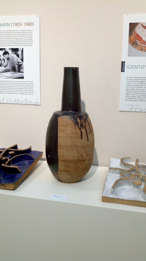
The work of Frans Wildenhain, artist and master ceramics craftsman, is both whimsical yet in many cases highly practical. After visiting one gallery exhibiting his work this past week, I have come to have a greater understanding of the effort that not only goes in to creating pieces, but for the work that goes in to putting a gallery exhibit together. Over the past few weeks, I have been discussing the nine steps of Visual Communication Analysis as prescribed by Helmers. While the initial steps require a surface level of analysis of the visual communication artifact, the latter steps involve reflection beyond the visual content. It is now my pleasure to complete steps five through seven of this process. Step five requires that the viewer consider what might be “absent” from the artifact. In the most common instances, this step refers to examining what is absent from an image; however, I was instructed to examine what may be absent from the entire exhibit featuring Wildenhan’s work. Included in this blog are three images taken of specific pieces in Wildenhan’s collection. As mentioned, it is possible to consider step five in multiple ways, thus, I will reflect accordingly on the manifest content which is intentional and the latent content which is this inherent absence that is prevalent in any collection.

First, what struck me as highly interesting about specific pieces was Wildenhan’s unique use of paint placed directly on the surface of his pieces. For example, in the first image at the bottom of this post, it appears that Wildenhan placed his hand prints around the vase he created. Additionally, he chose to allow black paint to drip freely down the side of the piece depicted second at the bottom. When thinking about what is absent from these pieces, there are many possibilities. To name a few, an alternate choice in color is absent, the imprint of another body part (such as his feet or the feet of a child) are absent from the vase first at the bottom. Also, there is deliberate lack of precision in the placement of the paint on the vase depicted second. As I will discuss in step six, there are always biases that both the artist and the viewer bring to the table that influence the creation and interpretation of specific artifacts. What is most interesting to me; however, regarding this idea of absence, is the mere fact that as a visual communication scholar, I am allowed to reflect on what might physically be missing from an exhibition. It is interesting to me because as a casual museum and art gallery visitor, I am bound to reflect on the physical artifacts displayed; however, I am less than likely to think twice about what is presented, how it is presented and what might be left out. The Widlenhan collection did an exquisite job displaying the artifacts and further giving narrative background on Wildnehan’s life. Though this is not frequently included in art exhibits, I would have loved to read about what specifically inspired Widlenhan to create specific pieces; more specifically, what moved him to place his hands on the vase. Was it a whim? Was it deliberate or an accident? Thus, this element was missing from the exhibit. Additionally, it is safe to say that all of his life work was not displayed and what would have been interesting to know would be why certain pieces were chosen for the collection. Do they work to convey a theme? Are these his greatest achievements? I could continue on an on about what may potentially be missing; however before blabbering on for longer, it is important to recognize the sixth step in the process: realizing one’s own personal biases and how that may influence one’s interpretation.

According to Helmers, “it is difficult to work against the grain and challenge ourselves to see things differently because so many aspects of visual understanding in our society rely on the same codes: balance, symmetry, conventions of beauty, (p. 49). I will be honest. When I walked in to the gallery, my initial thought was, vases as art? I quickly remembered personal time spent in pottery class and hushed my ill-bred thoughts when recalling my first abysmal failure at making a vase. Alas, after much time I became quite good at ceramics. However, even after taking classes, which are designated as “art” classes, my perception was still that ceramic is inherently a functional art. In my experience, pieces were created for the purpose of use and not for admiring. I was particularly blown away by the piece pictured third below. Though I am not entirely sure what it is, when I saw this, I knew that Wildenhan had far greater vision and talent than I ever could hope for. Alas, I fell in to the “I could do that” trap when I saw the black paint drizzles and hand prints. Yet it was my reflection on the fact that most likely, these splattering of paint were highly devised and intentional. Therefore, once personal biases were set aside, I was able to fully appreciate the beauty of the collection.

There is one final step that I will discuss at this point. I have already touched on it; however I will wrap up my thoughts concerning the effect of the exhibit on myself as the viewer. Essentially, what I came to understand after visiting the gallery was that in truth, I am highly untrained in the fine arts. I have an appreciation, but it is my desire to learn more about the fine arts so that I may more intelligibly critique and discuss. During the immediate moments after entering the exhibit, the overall presentation, lighting, spacing, and design of the gallery caused overwhelming calmness. In the past, I have visited galleries and displays that cause uneasiness or a feeling of being overwhelmed and stressed. The reason I did not feel either of these sentiments is because the gallery contained just enough artifacts to see in a reasonable amount of time and was also not over-burdened with text. Though I proposed that some additional background text would have been nice, I also believe that it is not entirely necessary. I truly feel as though I was able to take away the overall whimsical, simple, and highly artistic values imbedded within each artifact and as an overall feeling within the entire collection.

ImageImageImage

An Image is Always More than it Seems

ImageWhat I find especially intriguing about symbols and the use of symbolism in artwork is that we as the viewer are able to interpret a wide variety of meanings based solely on what we bring to the table.  The problem I discovered while attempting to select an image for analysis was that when one goes looking for “symbols” in artwork, we unfortunately create or fabricate symbols in the artwork that may or may not have been intended by the artist. With this being said, it is important to note that according to Helmer’s in her second chapter, “The Elements of Critical Viewing,” she discusses the idea that “symbols” can be virtually anything.  The key is that we as the viewer must attach a more “complex, psychological system of meaning” to the symbol based on prior knowledge or based on the context in which the symbol is placed.

As mentioned, the challenge of completing this analysis was not the possibility of finding a piece of art with a symbol in it. I have explained that a symbol, really, is anything that we desire to hold meaning. When examining artwork; however, one must truly search for an artist’s clear use of iconography so that in a critical analysis, we are not assigning unintended meaning or pulling “something out of nothing,” so to speak, to the artwork. The piece I will be analyzing is called “Big Bird Over Moonrise” and the artist is Richard Zackia. To better understand the artist’s use of symbols, it is first necessary to briefly discuss the visual elements within the piece and further explain how this image is an illustration of Helmer’s concept of “picturing place.” Essentially, Helmer’s explains that picturing place is the way in which images invoke memory(s) in the viewer of the piece. These memories are not necessarily in direct relation to the piece itself (i.e. a picture of the Grand Canyon does not always invoke a memory of a visit to the Grand Canyon); however, we draw some sort of connection to the piece based on prior experience. Helmer further explains that artists, photographers, and writers intentionally create images to invoke specific memories related to specific schema. In so doing, artists often take what is called “artistic license” to ensure that the memory they plan to invoke is, in fact, invoked in the viewers.

This image, “Big Bird Over Moonrise,” appears to be a black and white photograph of a landscape with specific, and intentional existing and created images highlighted and added to create this sense of picturing place. The image features a small village at the base of mountains. Above the village, a breathtaking night skyline is illuminated by a full moon. The foreground of the image consists of the landscape typically found in arid, desert climates including sand and other ground-cover vegetation found in desert-areas. The village itself is in the middle-ground of the image and most notably, there is a church and cemetery featured at the edge of the village while the remainder of the village blends more seamlessly in to the background. What is most significant and prominent in the piece is a silhouette of a dove that looms high above the village and is placed in the night sky directly next to the moon. With the exception of the dove, the piece appears to be a natural photograph of landscape. However, the dove, in size perspective to the village, takes up relatively the same amount of space as the village itself does. Due to its size and relative placement within the image, the dove is most certainly a dominant component of the piece. The dominance of the dove can also be explained by the artist’s choice of color in the piece. Though in reality, the location of the photograph is in color, the artist chose to use a black, white, and grey scaling. There are select elements in the piece, including the dove, that are colored in white while the rest of the piece is in grayscale. It is arguable that the artist strategically colored specific elements white to express dominance that will ultimately convey a deeper meaning and create Helmer’s idea of picturing place via symbolism.

Now that I have given a broad, visual description of the piece, I can discuss my thoughts on the artist’s possible use of symbolism. What is interesting about this piece is that in addition to the dove, the only other elements that are highlighted in white are the crosses both on top of the church and within the cemetery. Given the use of black, which according to Helmer’s can suggest death, and the strategic use of white, which typically suggests life or hope, it is arguable that this piece makes a statement with religious meaning. In addition, both the image of a cross and the image of a dove denotes specific  meanings, namely the dove as a symbol of hope or peace and the crosses as symbols of faith and hope. In this case, the crosses are used as grave markers and thus are meant to commemorate loved ones. However, the mere size and obvious importance of a white dove overlooking a more grim and dark village could be argued as representing God and further representing hope, specifically hope for life after death. Furthermore, as the crosses are meant to represent those who have died, it is possible that their significance in the piece indicates recognition of this hope, almost as if the dove is speaking to the crosses they are responding by illuminating a similar, white glow.

Though this analysis discusses the two obvious symbols used in the piece, it is quite possible that my interpretation had little to do with the artists’ intent. It is also important to note that typically, the dove represents peace and thus the dominance of the dove over-looking the town could suggest the idea that the location depicted in the image is a peaceful and calming place. Without a doubt, an image like this will ultimately invoke many interpretations; however, as explained previously, the use of symbols most often gives the viewer a basic sense of the artist’s intent in composing the piece. In conclusion, it is nearly impossible to say if my interpretation of the symbols is correct due to the versatile nature of symbols. However, with more research and possibly a discussion with the artist himself, an individual interested in analyzing this piece may be able to make some feasible interpretation of the relationship between the dove and the moon. Perhaps the significant size of the dove indicates that whatever the dove is meant to truly symbolize is more important that whatever the moon is meant to symbolize. Unlike, the dove, which is most typically the universal sign for peace and the religious association with the cross, the moon truly encompasses a plethora of meanings. Therefore, until I am able to fully research and complete all nine of Helmer’s analytical steps, it is challenging to determine a definitive analysis of the symbolism in this piece.

“Visual Music” by Burton Kramer and a Newspaper Girl’s Struggle to Understand

Is it possible for a graphic designer to struggle to analyze what would be considered “abstract” art? I believe that the answer is “yes.” Despite the fact that I am well aware of the principles of design and what is, for the most part, general practice among graphic designers, I suppose my dilemma stems from the fact that this particular piece takes liberties from the principles of design that I am most familiar with. Because I have a background in newspaper and magazine layout design, which follow very specific rules regarding alignment, contrast, spacing, etc. I realize that I have to look at this with a completely different critical eye.

To begin, I will assess the color and value of the piece. There are many colors and subsequent shades of those colors depicted, including a predominance of greens, blues, and corals. The other, lesser colors present include orange, violet, and a white, almost eggshell background. Though this is not a black and white image, I want to briefly touch on the fact that there are variations in the shades of the predominant colors. In particular, Kramer’s use of a lighter shade of blue on the small triangle that is half blue and half coral superimposed on the large green. I believe that this shading effect on the triangle creates the sensation that the small blue triangle is coming out of the picture. In other words, the blue in the small triangle is highlighted to stand out from the blues in the other two, larger triangles, and thus it jumps out at viewers. In addition, another literal element of this piece that I believe creates depth is Kramer’s use of lines and shapes. For example, the large, green triangle is strategically placed what appears to be beneath another layer of shapes, including the small triangle mentioned previously so as to create the sensation that there are multiple layers. The lines that actually form the different triangles are strategically broken up by the lines of another triangle or shape to create this layering sensation. Therefore, it is clear the Kramer intended for the small blue and coral triangle as well as the pinkish-grey box placed on top of the large green triangle to appear in the foreground of the piece because the lines that form each of these objects are not broken. Additionally, there is another layer that can be argued as the primary foreground of the piece. It consists of two, smaller boxes, one a light blue and one a light orange, I argue this because these two boxes are placed on top of the larger, light pink box and the blue and green triangle situated to the right of the piece respectively, are not disturbed by the lines of other shapes.

The final three literal elements of design are a bit more challenging to discuss due to the fact that they relate most easily to 3-dimensional objects, I will briefly discuss the form, texture, and space of this piece of art. The literal form of the piece is a flat canvas onto which the art itself was either painted or printed. However, as discussed earlier, despite the artwork’s 2-dimensional surface, the artist is able to create layering that gives the piece a 3-dimentional feel. Though layering is created for the naked-eye, the literal surface or texture of the piece is, simply, a smooth surface. It seems that the theme of this analysis is that there is layering that a casual viewer may not see; however, critically looking at space of this piece as it relates to Kramer’s created layers, it is apparent, that certain shapes are placed apart from each other and on top of each other to create this effect.

Though I have already tied in how the literal elements create an intentional arrangement of the objects in the artwork, it appears that there is a grid used for the purposes of orienting the shapes in the artwork and to highlight key shapes. For example, the small, rectangular boxes, squares, and triangles that are featured all around the large, green triangle, are either positioned horizontally or vertically. This indicates the importance of the larger objects, particularly the objects that are tilted to not fit within this created grid. The concept of dominance supports the idea that the green triangle and the offset, smaller shapes are more important due to their angle and color highlighting mentioned earlier. It is important to point out, that there is not a clear sense of balance in the artwork; however, the proportionate sizes of the large triangles versus the small, rectangles dotted around the piece not only create a foreground/background (i.e. the rectangles are small and in the background, and the larger shapes are in the foreground) the principle of proportion further lends itself to the constructed layering created by Kramer.

It is truly amazing how, to some, this piece may appear to simply be a random conglomeration of shapes and colors. However, through careful examination, we see that there was careful precision, planning and definite method used in the creation of this compelling piece.


Fantasy vs. Reality: Images of Tourism

American society is literally flooded, and quite possibly drowning in messages like “buy this” or “spend your next vacation here” or “vote for your favorite idol.” I truly believe that if we printed a comprehensive the list of messages communicated just to Americans with a particular focus on messages of an advertising nature, the list would stretch at minimum from east coast to west coast. When we broaden this assertion and apply it to images, which are in the most basic form visual communication, and the notion that all images communicate some sort of message (Helmers p. 26), it is arguable that the printed list could easily wrap itself all the way around the world and back. My point is, that as a student of communication and as an individual who is highly interested in the meaning, purpose, and resulting potential and actual outcomes of messages sent across a wide variety of mediums, I intend to use this blog not just as a means to complete an assignment for a class but as a vehicle to more deeply examine the extreme importance of visual communication and to further apply my findings to reflect on past, present, and future experiences.

I am particularly interested in images that create the sense of “picturing place.” According to Helmers, “Often when we look at a photograph or a painting of a place, we look through its flat surface to the reality beyond. We treat the image as a window rather than as something created by an artist or amateur at a particular time for a specific reason,” (p. 60). Thus, I will preface my analysis of the photograph included in this blog by noting that the photograph was a part of a tourism advertisement that I received via e-mail. Before briefly discussing my interpretation of the image through the construct of picturing place mentioned previously, it is necessary to make a first attempt at properly analyzing the image through the constructs of visual communication analysis. The first of these constructs is to record my initial impression.

Cliffs of Moher : Irish Tourism Promotional Photo

Oftentimes, when presented with advertisements, I am inclined to ignore the image; however, I was immediately intrigued to more closely examine the photograph due to its aesthetic nature and my personal familiarity with the content of the photograph. After a matter of seconds, I was able to process and piece together first, where this photograph was taken, and second, what was depicted in the photograph. To answer the former, the photograph was taken in Ireland, and to answer the latter, the photograph depicts a man and woman sitting on what appears to be the edge of the Cliffs of Moher. But I am getting ahead of myself because placing the image in context is step two. To continue with initial, and essentially split second impressions, I immediately felt a sense of peace and tranquility while examining the photograph and additionally I interpreted the photograph to be amiable in nature. Because of this initial impression, I was compelled to continue to examine the photograph and put it in to context. My initial impression of the photograph as amiable and thus desirable for further examination is due in part to my initial observation that the man and woman depicted are seated and smiling. My secondary observation that supports the notion that the photograph is amiable in nature is the design content of the photograph, including the soft colors, warm lighting, the inclusion of a calm sea, and the mere fact that if nothing else, this is a nature shot which are typically meant to illicit positive emotions.

As far as the context of the photograph (step two in the analysis process) I have identified where and what the photograph depicts; however, to begin to fully analyze the purpose of the photograph, there are other questions that must be answered. First, I must address who created the image. Though there is no direct link to the actual photographer, I do know that this image was produced by a photographer who traveled to Ireland and who was either commissioned by the International Irish Tourism Board or who simply took a photograph of the Cliffs of Moher and gave/sold the image to the Board. There is no date on the photograph; however, judging by the high quality of the image, and the clothing worn by the individuals in the photograph, the image was most likely taken within the last five to ten years. The date on the website page is 2010, thus, the image was taken either sometime in 2010 or in years prior. Because this is an image on the internet featured on a website and not in say, an art gallery or in a newspaper with an exact date, it is difficult to decipher the original date of publication or even location of publication; therefore, it is also a challenge to address the question of who was the original intended audience. I can; however, deduce that the current intended audience is former, current, and potential tourists or individuals who are interested in Ireland, and more specifically who are interested in tourists sites in Ireland. It is important to note, that the final element of putting the image in to context asks if there is a title or caption that explains the subject of the image. There is, in fact a caption that depicts the location and general content of the photograph. However, there is an important point to be made about the caption related to the entire content of the photograph. While the photo is clearly the Cliffs of Moher, the man and woman in the photograph are not explained. While on the surface level this it is understandable that the man and woman are not explained, I want to quickly revisit this  idea  we often forget that images are often created and are not simply a window in to the landscape. As in this man and woman are not inherently there because they were placed there for the photograph.

You may be wondering, why on earth is she still writing? I promise I am almost finished. I simply want to make the commentary that this image is the perfect example of how the messages that images transmit can cause us to think all sorts of things due to this notion that images are often created. It is my belief that the intent of this photograph was to attract visitors to go to the Cliffs of Moher by saying “look how beautiful this place is,” due to the nature of the photo and the general reaction of the individuals in the photo, and second, they are saying “you can do what these people in the photograph are doing.” My point of all of this, is that there is a solid difference between the fantasy image of the Cliffs of Moher created in this photo and the actual reality of this location. You might be thinking, “how does she know this?” I know this because I have been there and there are a number of flaws in the content that an individual who had not visited this location would not catch. First, the Cliffs of Moher are always, incredibly windy so the attire of the individuals is questionable. Second and most importantly, visitors to the Cliffs of Moher are in no way, shape or form allowed to be that close to the edge of the cliffs due to the fact that there is a preventative wall. Though this is just my opinion, I truly believe that this image uses the idea of “picturing place” to create a fantasy of what the experience will actually be. I am excited to delve further in to the nine other steps of visual communication analysis so that somewhat wild assertions (like the ones I have just made) will be academically supported instead of just supported by personal experience.

I want to conclude by apologizing to my professor for the length of this post. I promise that in the future, I will curb my enthusiasm and try to stick more to the actual assignment. I also would like to say that I am not trying to bash visiting the Cliffs of Moher–it was truly incredible. I simply wanted to point out, by way of a giant leap from my personal analysis within the first two constructs of visual communication analysis to the last two constructs which involve considering the effects on the viewer and ultimately my interpretation, that the image is an excellent example of how businesses take liberties or “artistic license” to illicit a desired response from an audience.